
Why Lettering Still Matters in a Mural
Lettering is one of those elements that people notice immediately when it is poorly executed. A crooked word, unusual spacing between letters, or a phrase that is hard to read from a distance can all detract from a beautiful mural, making the words feel like an afterthought.

Lettering in a mural needs to feel like part of the artwork, not something added at the end.
I understand why this happens. Lettering may appear simple at first; after all, it is "just words," right? However, once you place those words on a wall, everything changes. Factors like scale, distance, texture, and the shape of the wall all affect the letters. Additionally, how people move through the space can influence how the lettering needs to function.
That is why lettering is so crucial in murals. It is not just about creating something aesthetically pleasing; it is about making the words feel like they belong.
Lettering needs to be designed, not just added
A phrase on a mural cannot simply be dropped in at the end like a sticker. Instead, the words must be part of the composition from the beginning. They need appropriate size, weight, rhythm, spacing, and a relationship with the surrounding elements.
Sometimes, the lettering is the focal point. Other times, it supports the illustration. It may need to be readable from across the street or evoking a sense of softness, playfulness, boldness, elegance, loudness, or warmth. All these factors influence how the letters are drawn.
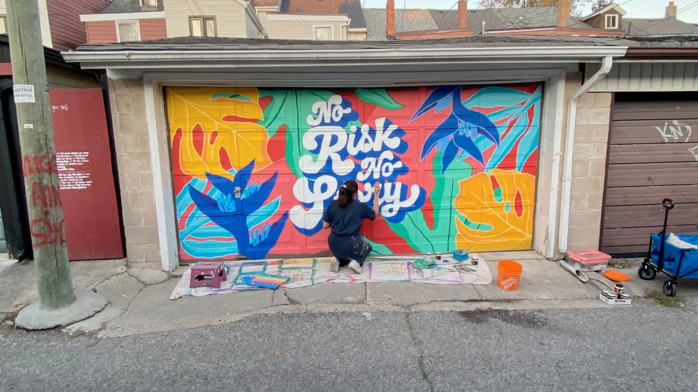
Good lettering has personality, but it still needs to be clear enough to read in the space.
This is where my background in graphic design, typography, lettering, and murals converges. I am not just considering whether a word looks nice; I am also thinking about how it sits on the wall, how it reads in the space, and how it interacts with the overall visual story.
Readability matters
A mural can be full of personality, but if the words are illegible, the message gets lost. This is especially vital for businesses, public art projects, schools, community spaces, and events. If a mural includes a name, phrase, quote, wayfinding message, or brand line, people need to understand it.
However, readability doesn’t mean the lettering has to be dull. Clear lettering can still own style, movement, colour, texture, and personality. The challenge is knowing how much the letters can do before they start to detract from the message.
Walls are not paper.
Lettering on a wall behaves differently than lettering in a sketchbook or on a screen. A wall can be textured, uneven, enormous, narrow, curved, or interrupted by doors, windows, vents, bricks, or awkward corners. The mural may be viewed from a sidewalk, a car, a hallway, a patio, or the other side of a room, all of which matter.
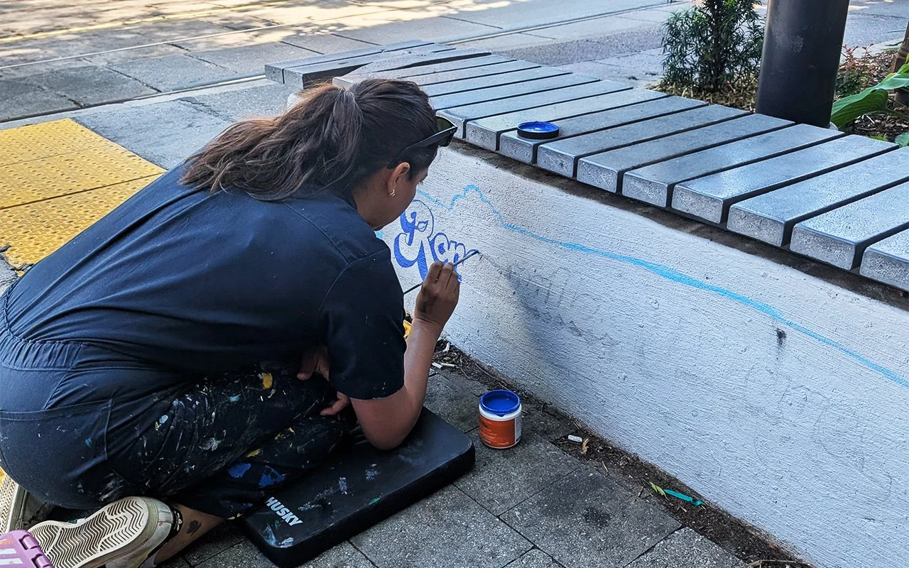
The words need to be considered early, with the same care as the rest of the mural design.
A word that appears balanced on an iPad can seem too small when painted on a wall. A thin line that looks elegant in a mock-up can disappear from a distance. Also, a minor spacing issue can become glaringly obvious when the letters are several feet tall.
That is why mural lettering must be adjusted for the physical space, not just for the digital sketch.
Lettering carries tone
Words have meaning, but lettering conveys personality. The same phrase can evoke completely different feelings depending on its portrayal; it can feel joyful, serious, nostalgic, bold, friendly, fancy, handmade, modern, soft, or energetic.
This is significant because murals typically have a purpose. A café mural might need to feel warm and inviting, a public art mural might aim to be visible and memorable, a community mural may need to feel approachable, and a brand mural should align with the business without appearing stiff. The lettering sets the tone and tells people how to feel even before they finish reading.
Lettering can make a mural more memorable.
Some murals are remembered for their images, while others are memorable for their words. The strongest murals often effectively combine both elements. A compelling phrase can capture attention, making the mural more shareable, emotional, and connected to its location. It can give people something to photograph, repeat, or cherish.
However, the lettering must feel intentional. When words and images are designed together, the mural feels complete. The message does not merely overlay the artwork; it integrates with it.
Why I still care about lettering
Before I began painting murals, I studied graphic design, typography, and lettering. I spent years focusing on letters, spacing, shapes, composition, and how words can become visual elements. That training remains evident in my mural work.
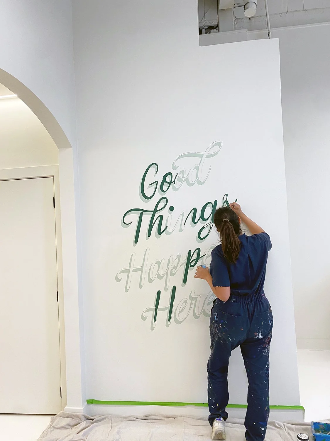
Lettering changes at mural scale. The wall, texture, distance, and viewing angle all affect how the words need to be painted.
Even when a mural features plants, colours, characters, patterns, or movement, I constantly consider structure. Where does the eye go first? How does the message read? Does the lettering support the mural or compete with it? Does it feel alive on the wall?
To me, lettering is not a minor detail; it is integral to the design. When done well, it enhances the mural, making it clearer, stronger, and more connected to the space.
Thinking about a mural with lettering?
If you are planning a mural that includes a phrase, quote, business name, message, or hand-painted words, it helps to work with someone who understands both murals and lettering.
Words on a wall need more than nice handwriting. They need design, scale, rhythm, and care.
That is where the magic happens.
Related readings:
From Sketchbook to Wall: A Real-Life Mural Breakdown
A good read about how a mural moves from early concept to final artwork.
What Makes a Good Mural Wall?
Helpful for understanding how wall surface, scale, access, and visibility affect the final mural.
Commissioning a Mural in Toronto
A useful next post for anyone thinking about hiring a mural artist for a custom project.