Colour Palettes That Make a Mural Stand Out
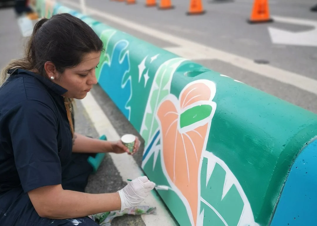
Colombians don't just appreciate colour, we live it! My childhood home featured a striking burnt orange wall and a cheerful yellow dining room that contrasted beautifully with our lush green backyard. Colombia is adorned with vibrant flowers, and the warm sunlight of the Andes brings everything to life.
Colour holds emotional and cultural significance, greatly influencing the atmosphere of a mural. I'm excited to share how I create palettes that breathe life into artistic expressions!
1. Start with the feeling
What type of vibe are you excited to share? Is it playful, calming, or bursting with energy? Let that guide you in picking out your anchor colours! Think about the message you want to convey to the world. My goal in my work is to spread joy. My murals connect me to Colombia, the homeland I hold dear, even after leaving it behind two decades ago.
2. Consider the architecture
Warm wood? Orangy brick? Greige concrete? Work with these elements instead of against them. Think about how the light hits the mural. Look at the wall at different times of the day. Also, if this is a cafe, where and how are people interacting with the wall within the architecture? Are they simply walking by, staring at it from a distance, or are they up close and intimate? These things will also determine your colours.
3. Balance the bold and the neutral
Too much intensity can be a bit overwhelming, don't you think? I love to balance bold colours with warm neutrals, greens, or soft off-whites. Not everything has to be super bright! Adding black and white can help to even things out. Remember to think about harmony, but also how to guide the eye across your wall. Treat it like a fun design puzzle to solve!
4. Think about light
Indoor lighting and outdoor shadows can affect how we perceive colours. It's essential to visit the site before making colour selections to see how the light interacts with the space. I appreciate using vibrant hues, but I recognize that a wall exposed to direct sunlight may become too bright, so it might be necessary to tone the colours down a bit.
5. Find the story
A story holds deep meaning and reflects anything from struggles, triumphs, and the lessons learned along the way. By valuing these narratives, we not only acknowledge the past but also foster understanding and connection with one another. I research colour palettes that feel authentic and rooted. Colour carries meaning, so respect it. This principle applies to cultural, community-based, and branding murals. Some of my favourite combos are:
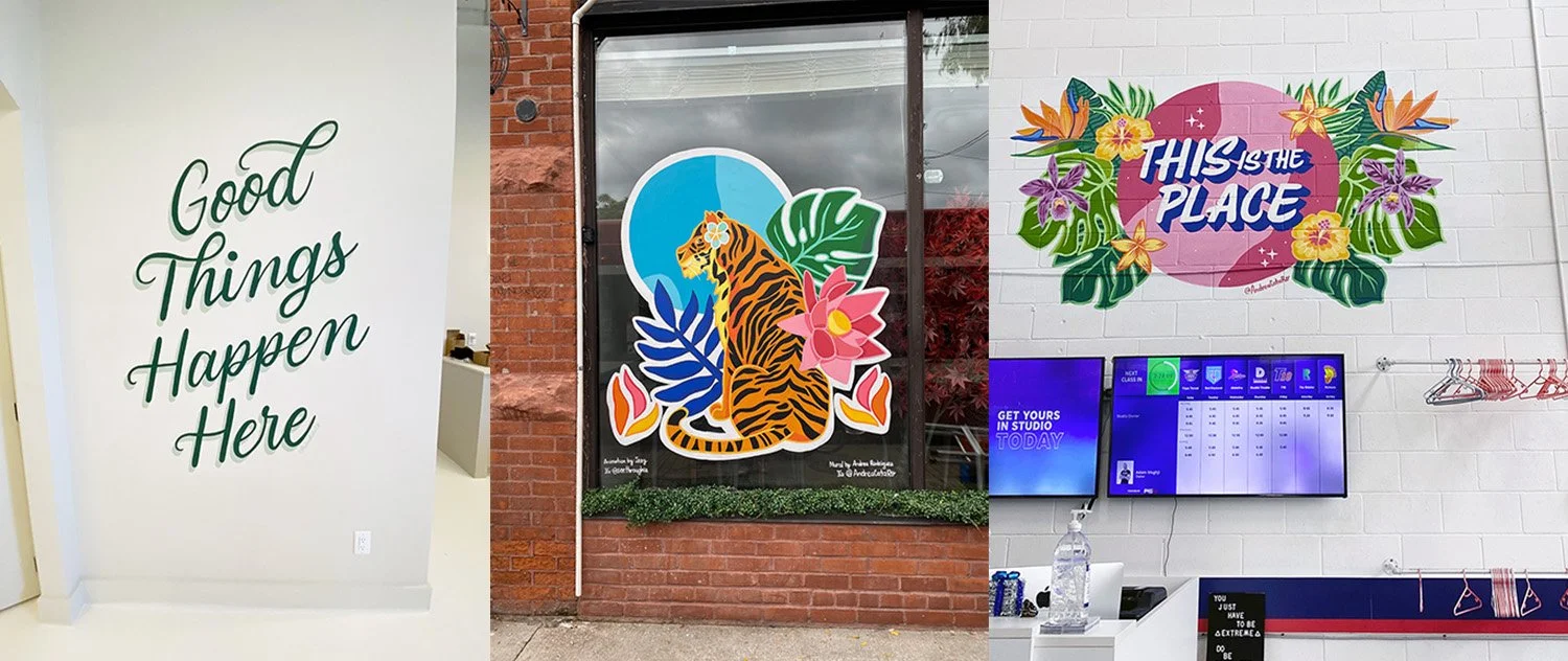
Teal, mango-yellow, coral, cream
Deep blue, gold yellow, blush pink
Jungle green, magenta and blue sky
🎨 Dreaming in colour?
If you've got a wall but aren't sure what colours will work best, I can help. From brand palettes to nature-inspired combos, I love building colour stories that make murals feel right at home.
Sign up for my newsletter today to stay updated on the latest trends, tips, and behind-the-scenes content! Don't miss out, join the community now!


